
As part of my graphic design course assessments, I had to design a logo for myself, a personal identity. In order to figure this out, I had to draw a mind map of myself – what I like/dislike etc so that I can come up with a logo that represents me.
I wrote this as part of my assessment: I like simple, sharp and minimalistic designs. In particular, I like designs that use negative spacing as they look clean and simple yet they are evidence that a lot of design thought went into the final artwork, like modern contemporary art.
My aim was to create a logo to reflect creativity and minimalism in my design to communicate that I am an all rounder graphic designer.
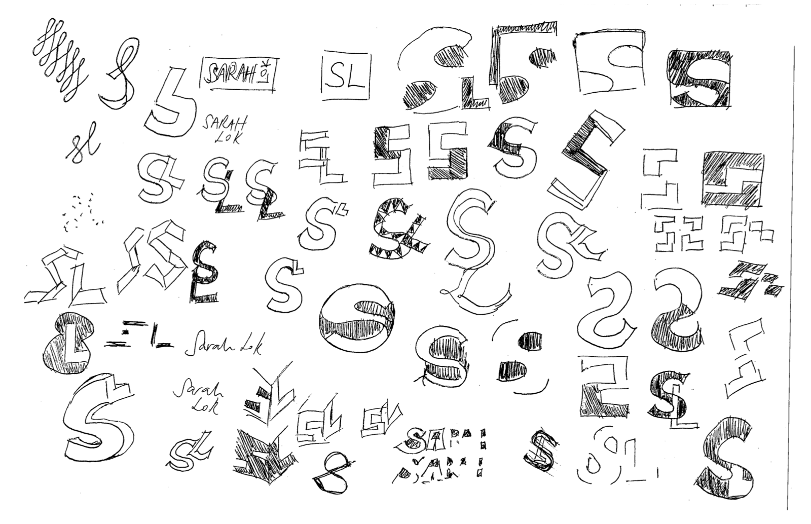
Here’s a bunch of sketches I did before I got to my final design:
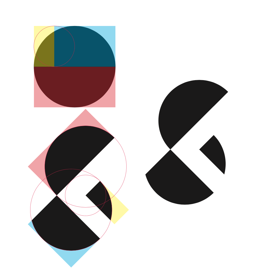
After many sketches, comps and revisions, this is the final design. I am actually very happy with my SL logo as I managed to incorporate negative spacing into my personal logo and crafting out my initials by dividing a circle.
You can see my logo in use in my previous post.